Creating Stunning Boudoir Sets Through Color Harmony
Luxury boudoir through color
– 4 min read

Luxury boudoir through color
Boudoir photography is more than posing and lighting — it's storytelling through color, texture, and mood. One of the most overlooked but powerful tools in a boudoir photographer's arsenal is color harmony. When done right, your set, wardrobe, and subject come together in a way that feels high-end, intentional, and unforgettable.
In this blog, I’ll break down how to use color harmony to elevate your boudoir sessions, create mood boards your clients swoon over, and make your images look like they belong in a luxury magazine spread.
Color harmony isn’t just about choosing pretty shades — it’s about creating a mood that supports your subject's energy. Think of it like a soundtrack for your photoshoot. When your background, wardrobe, and props all play together in the same key, your client becomes the star of the visual symphony.
Clashing tones or busy patterns can distract the eye and take focus away from the body and emotion. But when everything flows together, the viewer is pulled into the image — and that’s where the magic happens.
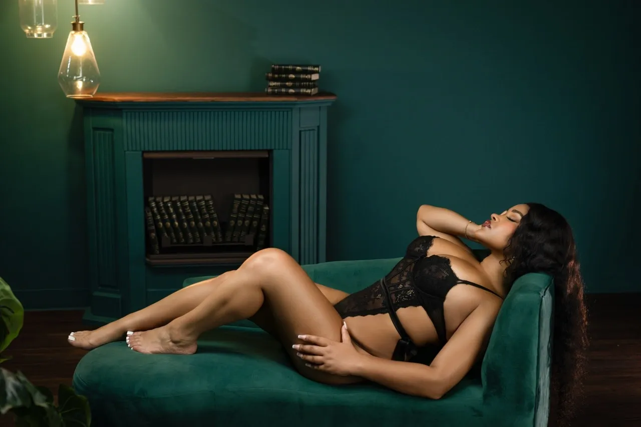
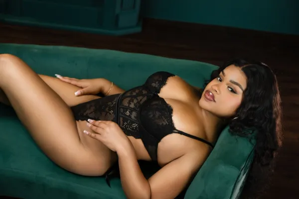
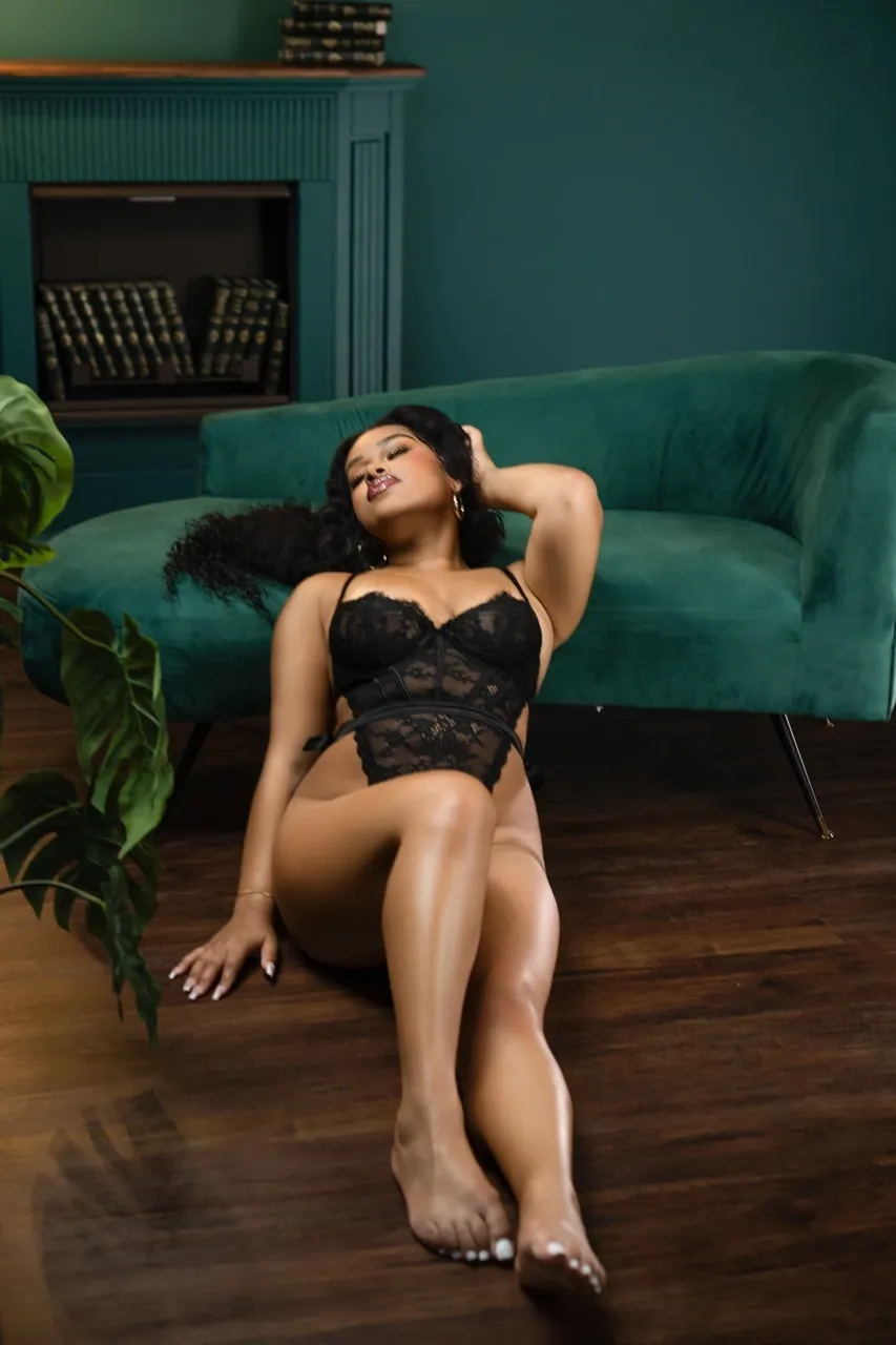
The set in these images uses a deep emerald green as the dominant tone, paired with warm wood floors and black furniture accents. These earthy, moody colors create a luxe, editorial feel. Darker jewel tones like emerald, burgundy, and navy work especially well in boudoir — they enhance shadows, give skin a luminous glow, and feel sensual without being over-the-top.
You don’t need an expensive set to pull this off. Even a painted wall or velvet curtain can bring richness and depth when chosen intentionally. Stick to a 2–3 color palette, and let textures (like lace lingerie or velvet furniture) do the rest of the heavy lifting.
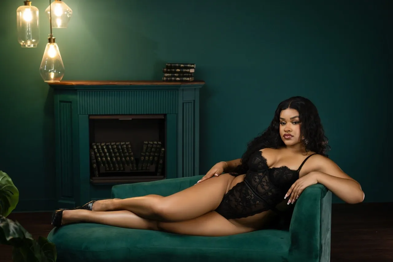
One of the most elegant tricks in boudoir set design is to use a monochromatic approach. In this session, the emerald couch matches the background wall, pulling the entire environment into a single tone family. This kind of styling is soothing to the eye and allows the subject to stand out without overwhelming contrast.
Want to take it a step further? Stack books, add gold-trimmed details, or use lighting fixtures in the same tone family — just like the vintage bulbs shown here. The result is a cohesive, elevated scene where every detail feels intentional.
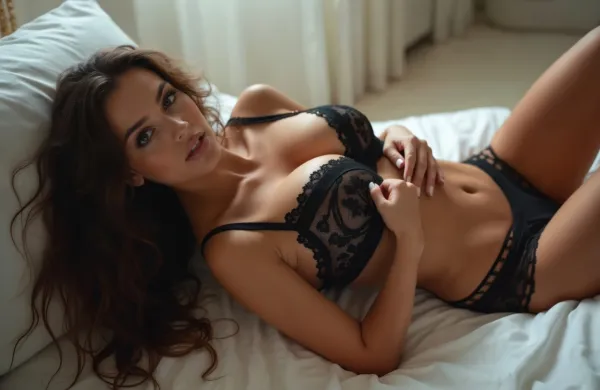
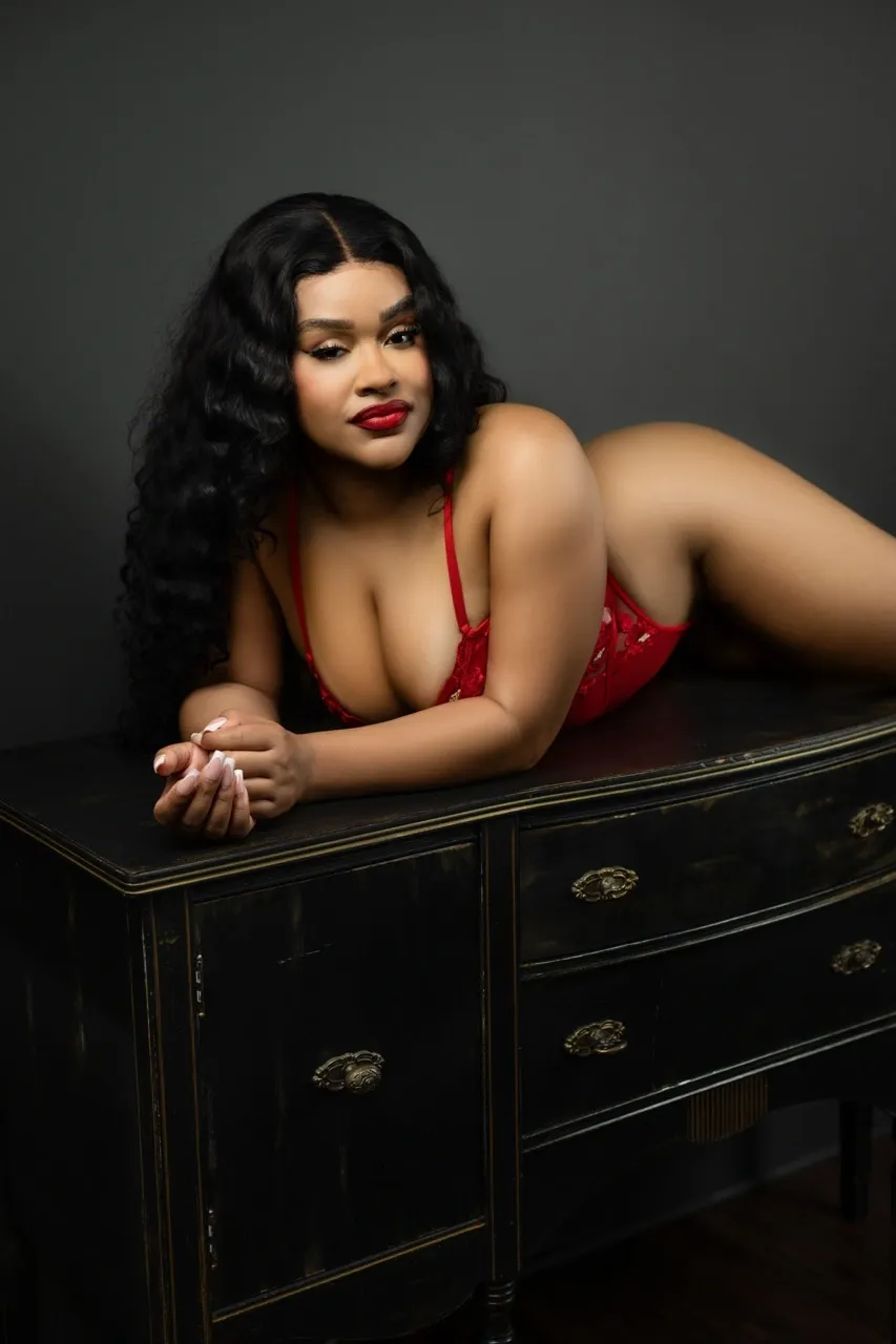
Black lingerie is the boudoir equivalent of the little black dress. It’s timeless, flattering on every skin tone, and delivers that undeniable mix of elegance and sensuality. Against a deep green backdrop, black lingerie pops — not in a distracting way, but with just enough contrast to spotlight the subject’s form, curves, and confidence.
Black also enhances the mood by creating natural shadows and adding mystery to the overall image. If you're unsure what color wardrobe to recommend to clients, black is always a safe — and stunning — choice, especially in monochromatic or moody-toned sets.
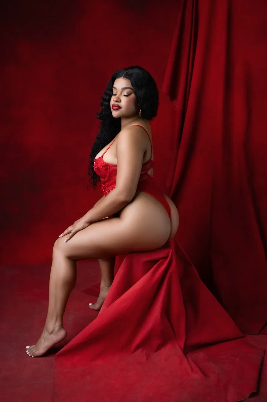
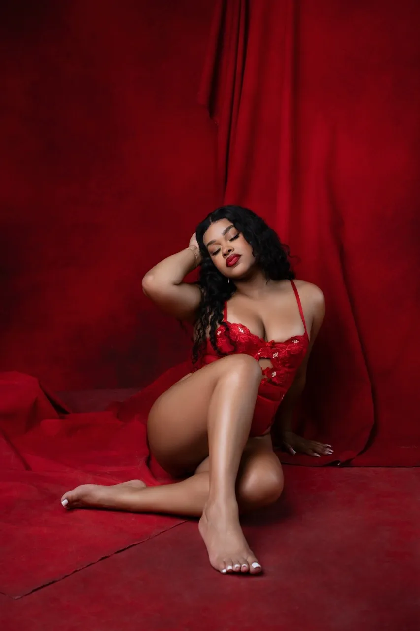
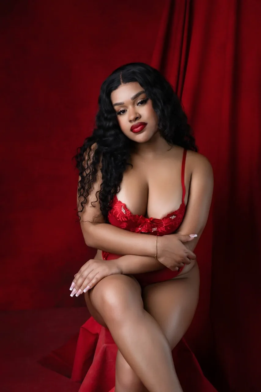
Every boudoir shoot tells a story — and color is part of that language. Soft pinks and creams might whisper romance, while rich greens, red, and blacks, like in this shoot, demand attention and exude power. Before your session, think about the story you want to tell, and use your set styling to support that narrative.
Build a look that doesn’t just flatter your client, but empowers them. When you approach styling through the lens of color theory and mood, you’ll start creating galleries that feel cinematic and emotionally rich.
In boudoir photography, creating luxury isn’t always about designer lingerie or a massive studio budget — it’s about intentional design. When you master the art of color harmony, your images will naturally feel more expensive, more cohesive, and more emotionally powerful.
Next time you're planning a session, start with your palette. Build your set, wardrobe, and props around a unified tone — and watch how your images instantly level up.
Learn Boudoir Photography on BIB TV